How to Reduce Shopping Cart Abandonment (11 Easy Ways)
 John Turner
 John Turner
Want to learn how to reduce shopping cart abandonment and recover lost sales from your eCommerce store?
Every time a shopper adds something to their cart but doesn’t check out, you lose potential revenue. But with a few smart changes, you can stop that from happening and turn more visitors into paying customers.
In this guide, I’ll walk you through simple, proven ways to reduce shopping cart abandonment so you can keep more of the sales you’ve already earned.
Quick tips to reduce shopping cart abandonment:
- 1. Run a Personalized Giveaway
- 2. Target Users with Exit-Intent Popups
- 3. Re-engage Inactive Website Visitors
- 4. Personalize Your Campaign Messaging
- 5. Offer Free Shipping
- 6. Use Trust Badges
- 7. Optimize the Checkout Page
- 8. Display Social Proof
- 9. Create Urgency with Countdown Timers
- 10. Retarget Lost Customers
- 11. Optimize Page Loading Times
- FAQs on Reducing Shopping Cart Abandonment
What Is Shopping Cart Abandonment?
Shopping cart abandonment is when online shoppers add items to their shopping cart but leave your website before checking out.
On average, 67.91% of all shopping carts are abandoned. This means around 2 out of 3 shoppers that add items to their cart will leave without paying for their goods. This translates as a whole lot of revenue your small business misses out on.
Despite this news, there are a few ways to prevent this scenario from happening. If you follow the tips in this article, you’ll see your cart abandonment rates drop and your online revenue increase.
How to Reduce Shopping Cart Abandonment
If you’ve spent any time researching how to reduce shopping cart abandonment, you’ve likely picked up a few of the more common tips. Normally they’ll talk about how to improve your checkout flow, which is excellent advice.
But we didn’t want to go over the same ground. That’s why you’ll find several unique tips below for reducing shopping cart abandonment across your entire eCommerce store.
Let’s get started with the first tip.
1. Run a Personalized Giveaway
Why this works: Shoppers are more likely to complete their purchase when they’re rewarded with something relevant. A targeted giveaway creates excitement and gives them a reason to stay and buy.
One of the easiest ways to reduce cart abandonment is to offer users an incentive to follow through with a purchase. One way you can do that is to provide automatic entry into a giveaway or contest whenever anyone buys something on your website.
However, many eCommerce giveaways don’t always offer a prize relevant to customers and don’t offer it at the right time. As a result, they end up with an email list full of irrelevant leads.
If you visit a website intending to buy some noise-canceling headphones, you probably wouldn’t be enticed by a giveaway promising noisy kids’ toys.
To get the best results from your onsite giveaways, keep your prizes relevant to shoppers and only let them join when they deserve it.
You can do this by finding out what product category abandoning shoppers are interested in and offer a relevant prize before they leave.
For example, if a shopper has an item in their cart from the electronics category, you can show them a campaign like the one below.
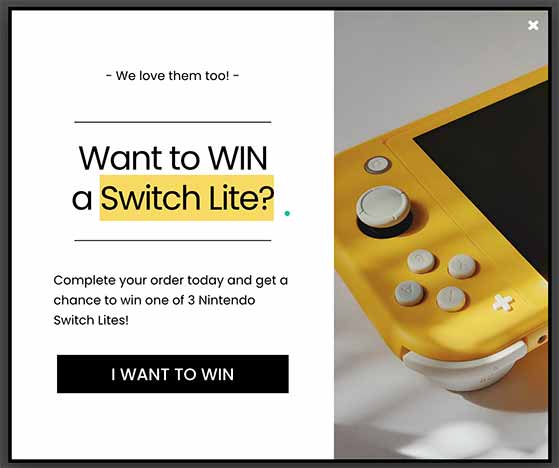
Or if they’re interested in beauty products, you can trigger this campaign:

With this approach, you’ll get people’s attention with the right prizes at the right time. This will increase their likelihood of hitting the “Buy Now” button.
The easiest way to run a giveaway on your WordPress website is with RafflePress, the best WordPress giveaway plugin. With RafflePress’s drag-and-drop giveaway builder, you can create a contest in WordPress in minutes.
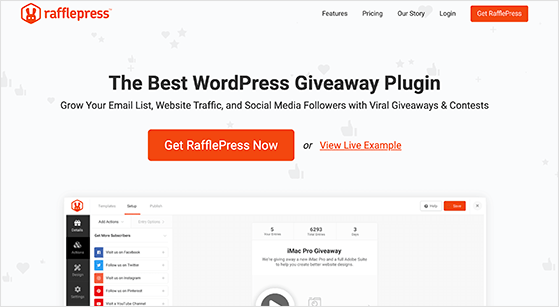
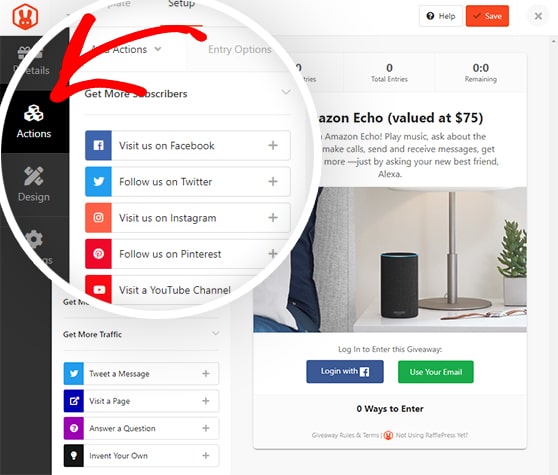
It comes with goal-based giveaway templates you can launch with a single click and has tons of entry actions you can use to:
- Add more email addresses to your list
- Increase your social media followers
- Raise brand awareness
- Promote new products
- Drive website traffic
- And much more
You can display your giveaway on a distraction-free giveaway landing page to boost entries. And with the random winner generator, you can choose winners randomly and show the results right in your giveaway widget.
Create an account with RafflePress today.
Want to recreate the giveaway campaign examples above? You can do that with exit popups, which we’ll explore next.
2. Target Users with Exit-Intent Popups
Why this works: Exit popups grab the shopper’s attention at the exact moment they’re about to leave. This last-minute nudge can help recover otherwise lost sales.
Exit popups are another excellent way to reduce shopping cart abandonment. Exit-intent popups display your campaign when users are about to leave your website. This allows you to capture their attention right when they plan to abandon their shopping cart.
You can use this moment to incentivize potential customers with your giveaway from the tip above. Or you could offer a coupon code, promotional discount, or reduced shipping charges to sweeten the deal.
The easiest way to create an exit-intent popup is with OptinMonster.
OptinMonster is the best lead generation software for small businesses. It helps you to encourage visitors of your eCommerce website to take the actions you want them to on your site, such as:
- Purchasing a product
- Signing up for your newsletter
- Visiting specific website pages
- Leaving a product review
It does this with optin campaigns, messages that appear on your site as popups, slide-in boxes, floating bars, and more. These messages have a call-to-action (CTA) that prompts users to follow through with the action you want them to take.
You can also A/B test your campaigns to learn optimization tricks to improve the user experience and conversions. Additionally, OptinMonster integrates with many email marketing platforms, payment methods, and marketing tools, including Shopify, Constant Contact, WooCommerce, and more.
By using OptinMonster’s exit-intent popups, you can convince hesitant users to go through with their purchase at a critical moment in the customer journey.

Want to learn more about OptinMonster? Check out this post, Is OptinMonster Worth It? An Extensive Review.
3. Re-engage Inactive Website Visitors
Why this works: Inactivity popups bring distracted visitors back to their carts before they forget. They give you a second chance to close the sale without being pushy.
When shopping online, it’s easy for users to lose focus.
They might get a phone call, then a Facebook message, then an Instagram DM… Before long, they’ve forgotten all about that shiny new pair of sneakers in their shopping cart.
As a business owner, it’s your job to refocus their attention on your store, ensuring your customers get the items they want.
An easy way to do that is with OptinMonster’s InactivitySensor™. This is a trigger that shows your popup or campaign when users have stopped using their browser for a certain amount of time.
Similar to exit-intent popups, you can use this drop-off opportunity to offer a discount, coupon code, or remove shipping fees. According to Statista, 8% of customers cite not being able to find a coupon code as the main reason for abandoning their cart.
Here’s an example that Skate.co.uk used to increase sales by £2000 per day:
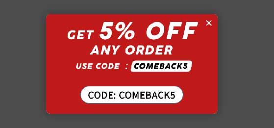
After 25 seconds of inactivity, users would see the popup shown above. You can build a similar campaign in just a few minutes to re-engage visitor attention to your checkout experience and reduce your shopping cart abandonment.
4. Personalize Your Campaign Messaging
Why this works: Personalized messages feel more relevant and trustworthy. When shoppers see content tailored to their needs, they’re more likely to convert.
Many online popups can feel impersonal and distracting, but it doesn’t have to be that way.
By creating more personalized campaigns, you can communicate with shoppers on a far deeper level and keep their attention longer.

With OptinMonster’s:
You can create upfront messaging for customers personalized with their name, location, and even based on how they’ve used your website.
Specialty flooring company IncStores took this approach. They a/b split-tested different personalized headlines in their campaigns, growing their contact list by over 300% and recovering 2.65% of abandoning visitors.
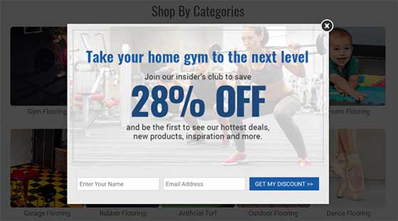
The more you can experiment with different personalizations, the more likely you are to reduce cart abandonment rates.
5. Offer Free Shipping
Why this works: Unexpected shipping costs are a major reason people abandon carts. Offering free shipping removes that barrier and helps increase checkout completion.
According to the Baymard Institute, a common reason for shoppers to abandon their carts are hidden costs at the end of the checkout process. Unexpected costs are often the result of taxes and shipping costs.
Faced with this expense, many users will decide to shop around for a better deal, resulting in a jump in your shopping cart abandonment rate.
One way online retailers can reduce costs is to offer free shipping and promote it before people reach the checkout page. You can do this with a floating bar positioned across the top of your site for everyone to see.
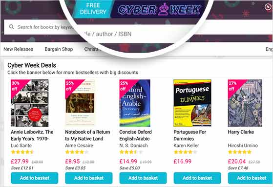
This will encourage shoppers to load up their carts and complete their purchases, confident in the knowledge there won’t be any extra fees.
Pro Tip: Try running cart abandonment emails that offer free shipping. With a catchy subject line and the promise of free shipping, you can boost open rates and successfully win potential customers back.
6. Use Trust Badges
Why this works: Trust badges show shoppers your site is secure and legitimate. This builds confidence and makes people feel safe entering their payment info.
Our next tip is a solution you’ve likely heard before, but it’s so important that it’s worth repeating.
eCommerce sites should always include trust badges across their website. This is especially important for checkout pages.
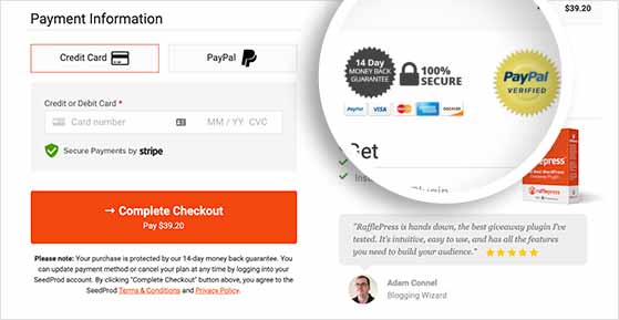
Trust badges are images and icons that let shoppers know that your website is secure. They could be:
- Accepted payment option logos (like credit cards, Apple pay, PayPal, and Amazon)
- Industry award badges
- Secure payment icons from places like Norton and VeriSign
- SSL security badges
- Money-back guarantee seals
Check out this post to learn more about using trust badges.
Icons like these can help your customers feel more confident about using your website, products, and services. And with more confidence comes a greater likelihood they’ll enter their credit card information and follow through with their purchase.
7. Optimize the Checkout Page
Why this works: A fast, simple checkout removes friction. The easier it is to pay, the fewer people will drop off before finishing their order.
If you want to reduce shopping cart abandonment for your online business, you need to design your checkout page so that it makes shoppers want to complete the sale.
This typically involves making the checkout process as simple as possible. For example, you can reduce the number of form fields, offer guest checkout options, or add a progress indicator to multi-step checkout processes.
But, there are other ways to reduce cart abandonment on the checkout page as well.
If you run your online store with WooCommerce, you can use SeedProd to create a custom checkout page that’s optimized for conversions.
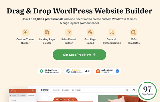
SeedProd is the best landing page builder for WordPress, you can use it to create any type of landing page for your site. With its WooCommerce blocks, you can also easily create custom checkout pages, cart pages, and product pages for your online store.
Using the drag and drop builder, you can quickly add conversion-focused blocks to your checkout pages like progress indicators, testimonials and star ratings, countdown timers, and more.
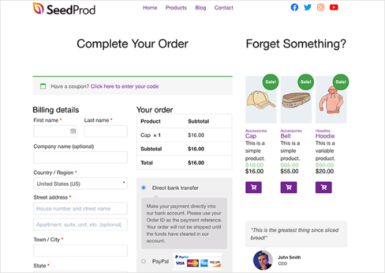
You can even display featured or sale products on the checkout page to boost your average order value.
8. Display Social Proof
Why this works: When shoppers see others buying or interacting with your brand, it creates trust and FOMO. That extra validation can help push them to complete their purchase.
Showing social proof on your website and product pages is another effective way to reduce shopping cart abandonment.
Social proof shows shoppers that people have spoken positively about your products or services.
There are many ways to use social proof, but the most effective is social proof notifications. These are small popup messages that show when someone has positively engaged with your brand, such as:
- Entering your giveaway or contest
- Signing up for your email newsletter
- Buying a product or service
- Registering for a webinar
- Leaving a 5-star review
Social proof notifications help reduce cart abandonment by building trust between you and hesitant shoppers. When users see the notification, it creates the fear of missing out (FOMO).
FOMO marketing is the idea that people don’t want to miss out on the positive things they see other people enjoying. When you create social proof notifications showing other shoppers buying your products, it motivates visitors to do the same.
The easiest way to create social proof notifications is with TrustPulse.

With TrustPulse, you can build notifications in just a few minutes, without writing a single line of code. You can customize your notifications to suit your brand, and it’s the most cost-effective solution on the market.
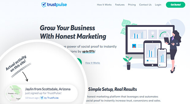
Best of all, you can use TrustPulse to significantly reduce cart abandonment and increase conversion rates by up to 15%.
9. Create Urgency with Countdown Timers
Why this works: Countdown timers create a sense of urgency. When people think they might miss out, they’re more likely to act quickly and complete their order.
Another excellent tactic you can use to reduce shopping cart abandonment is to build a sense of urgency with shoppers. You can do this by telling users that their chance to claim a discount or enter your giveaway is ending soon.
The best way to create urgency is with a countdown timer.
You can use OptinMonster to add static or dynamic countdown timers to your campaigns.
Static timers are a good solution if your sale has a fixed end date. Dynamic countdown timers give all website visitors the same amount of time to claim your special offer.
For instance, the timer will start when users first see your campaign, rather than on a specific date.
As a result, you can create urgency for all your site visitors, moving buyers through your checkout process.
10. Retarget Lost Customers
Why this works: Retargeting reminds visitors about the items they left behind. These gentle follow-ups bring people back to your store and recover sales you would’ve lost.
Nothing is more frustrating than spending time attracting potential customers to your online store, only to see them leave and never return.
But what if there was a way to get those users back? With retargeting, you can!
With a retargeting campaign, you can show ads to people who have recently visited your website and persuade them to come back.
For instance, you can target users who have abandoned your shopping cart and show them a message promising a discount for coming back and completing their purchase. You can even remind them of your return policy to ease their fears.

You might need to gather some information first, for this cart recovery solution. Check out this article for instructions on collecting demographics and interest reports in Google Analytics.
11. Optimize Page Loading Times
Why this works: Slow-loading pages frustrate shoppers and increase bounce rates. Faster pages mean better user experience and fewer abandoned carts.
Improving the speed of your online store is another important factor to consider. Even a 1-second delay in page loading times can significantly decrease shopping cart conversion rates.
If your checkout pages have disappointing metrics and are slow to load, they will frustrate shoppers, causing them to take their business elsewhere. So you should optimize your product and checkout pages to be as fast as possible.
First, look at your product images and reduce the file size without compromising their quality. You can then look at removing any bloated WordPress plugins you don’t use or find speed-optimized alternatives.
Take a look at these easy tips to speed up WordPress to get started.
Once your pages load faster, there’ll be 1 less reason for shoppers to abandon their purchases.
Free: Download Our Giveaway Playbook
Templates, prize ideas, and promotion strategies in one guide.
FAQs on Reducing Shopping Cart Abandonment
We hope this article helped you learn how to reduce shopping cart abandonment.
If your store is still in the planning stages, you might want to create a coming soon page to tell visitors about your new website. Or to track your store’s performance, follow this guide to add Google Analytics to WooCommerce.
While you’re here, don’t forget to follow us on YouTube, Twitter, and Facebook for more great tips to grow your business.
