Exit Intent Popups: How to Turn Lost Traffic into Sales
 John Turner
 John Turner
Want to stop losing visitors right before they leave your site? Exit intent popups are one of the easiest ways to turn that traffic into real results. You can grow your email list, reduce cart abandonment, or recover sales that would’ve slipped away.
In this guide, I’ll show you how exit intent popups work, why they’re so effective, and how to use them without annoying your visitors. I’ll also share a short list of proven popup ideas that actually get clicks, not just traffic.
Quick Exit Intent Popup Ideas:
- 1. Run a Giveaway with RafflePress
- 2. Offer a Content Upgrade
- 3. Remind Visitors About Cart Items
- 4. Offer a Discount or Free Shipping
- 5. Add Urgency with a Countdown Timer
- 6. Suggest a Related Product or Post
- 7. Use a Yes/No CTA for Higher Engagement
- 8. Show Social Proof to Build Trust
- 9. Ask for Feedback with a Quick Survey
- 10. Grow Your Social Media Followers
- 11. Use Animation to Draw Attention
- 12. Make the CTA Clear and Specific
What Is an Exit Intent Popup?
An exit intent popup is a message that appears right as someone’s about to leave your site. It tracks user behavior, like moving the mouse toward the browser bar or scrolling back on mobile, and triggers a targeted offer before they go.
The goal is simple: stop visitors from bouncing and give them one last reason to take action. That might be a coupon, a giveaway entry, a content upgrade, or a quick reminder about their cart.
Popups often get a bad rap for being annoying. But exit intent popups are different because they only appear when someone’s already leaving. There’s no harm in trying one last nudge, and the results speak for themselves.
- Medstar Media used exit popups to increase client conversions by 500%
- Fastrack recovered 53% of abandoning visitors with a simple lightbox popup
If you’re not using exit intent popups yet, you could be missing out on a big chunk of leads and revenue.
How Do You Create an Exit-Intent Popup?
The easiest way to create an exit-intent popup is with a popup builder.
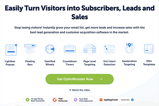
The easiest way to create an exit intent popup is with a drag-and-drop popup builder. You don’t need to touch any code or mess with complicated settings. Just pick a template, customize the design, and publish it on your site.
OptinMonster is one of the best tools for this. It includes:
- Exit intent targeting for both desktop and mobile
- Dozens of ready-made popup templates
- Smart display rules and built-in A/B testing
It also works with WordPress, Shopify, WooCommerce, and major email platforms like Mailchimp and Constant Contact.
Follow this step-by-step guide to create an exit popup with OptinMonster.
Free: Download Our Giveaway Playbook
Templates, prize ideas, and promotion strategies in one guide.
12 Exit Intent Popup Ideas That Actually Convert
Now that you know what exit intent popups are and how to set one up, let’s talk strategy. The type of offer you show makes a huge difference. Some popups drive clicks, while others get ignored or closed right away.
These twelve ideas are the ones I’ve found work best. You don’t need to try everything. Just pick one that fits your goal and start there.
1. Run a Giveaway with RafflePress
Giveaways are one of the easiest ways to grab attention, especially when someone’s about to leave your site. You can use an exit intent popup to invite visitors to enter for a chance to win a prize in exchange for their email.
With RafflePress, it’s simple to set up a high-converting giveaway.
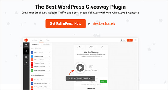
Just choose a template, customize your prize details, and use the built-in landing page or widget to collect entries.
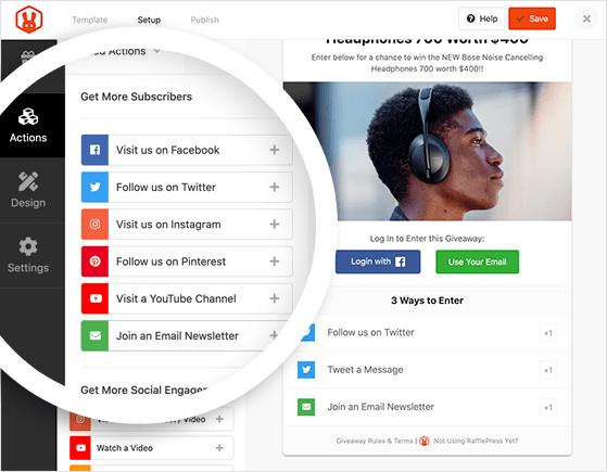
- Offer bonus entries for sharing or referrals
- Target your popup only to new visitors
- Send abandoning users straight to your giveaway page
Here’s an example of what that looks like:
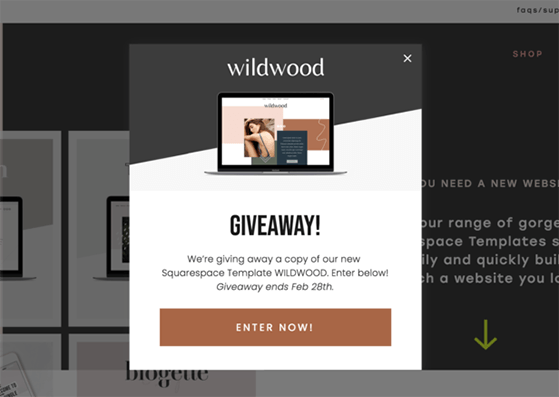
If your goal is to grow your list or create buzz around a product launch, this is one of the most effective popup strategies to try.
For more details, see my guide on how to create an online contest with RafflePress.
2. Offer a Content Upgrade
If someone’s reading your blog and getting ready to leave, that’s the perfect moment to offer a little extra value. A content upgrade is a free bonus that’s directly related to the topic they were just reading.
For example, if your post is about running a photo contest, your popup might offer a downloadable checklist or PDF version of the guide.
Since the upgrade matches what they were already interested in, it feels helpful instead of disruptive, and that’s exactly what makes it work so well.
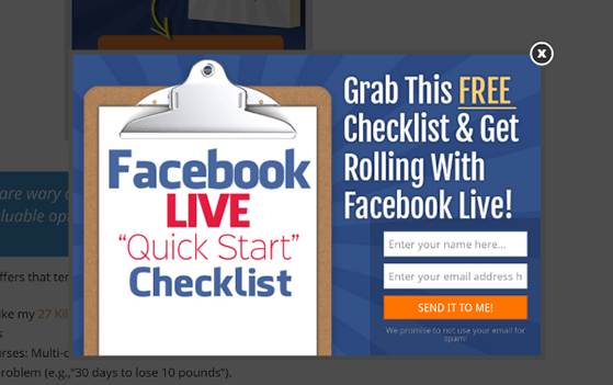
You can learn more about high-converting content upgrades in this guide.
3. Remind Visitors About Cart Items
One of the biggest reasons people leave an online store without buying is simply forgetting they had items in their cart. That’s where exit intent popups come in.
Just before someone leaves, you can trigger a friendly reminder like “Wait, you still have items in your cart.” Add a product image or a quick summary of what they’re leaving behind.
This works because of something called the Zeigarnik Effect. People are more likely to complete a task once it’s been started but left unfinished.
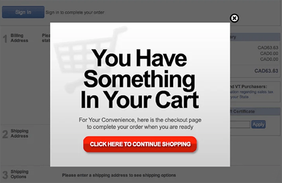
If they’re not ready to check out, give them the option to save their cart for later. You can also collect their email so you can follow up with a cart recovery sequence.
Need help setting that up? Here’s how to create an abandoned cart email strategy.
4. Offer a Discount or Free Shipping
If someone’s about to leave without buying, a last-minute discount or free shipping offer might be all they need to complete their order.
Use an exit intent popup to display a coupon code, or even better, apply the discount automatically with a single click. This reduces friction and keeps the checkout process smooth.
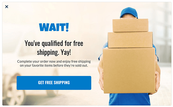
This type of popup does double duty. It recovers a potential sale and collects the visitor’s email so you can follow up later.
Just make sure you show the offer before they close the tab. Timing is everything with exit intent popups.
5. Add Urgency with a Countdown Timer
People tend to put off decisions, especially when there’s no deadline. That’s why adding urgency to your exit intent popup can boost conversions fast.
A countdown timer shows visitors that time is running out. Whether it’s a limited-time discount, free shipping offer, or bonus freebie, the ticking clock encourages them to act now instead of later.
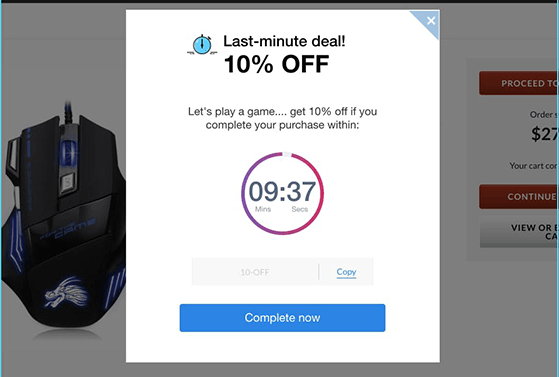
This tactic works especially well for flash sales, product launches, and seasonal offers. It taps into FOMO and gives people a clear reason to take action before the deal disappears.
6. Suggest a Related Product or Post
Not every visitor is ready to buy or sign up, but that doesn’t mean you have to lose them. Sometimes, all it takes is pointing them to something else they might find useful.
Use your exit intent popup to suggest a related blog post, product, or free resource. This gives people a reason to stay on your site longer and explore more of what you offer.

Make sure the content or product you suggest is closely tied to what they were just viewing. The more relevant it is, the more likely they are to click.
7. Use a Yes/No CTA for Higher Engagement
Sometimes asking a simple question works better than a traditional form. A Yes/No popup gives visitors a clear choice and that small action can lead to big results.
This works because offering two options makes users feel in control. Most will click “Yes” if the offer is strong, especially if the “No” option is dull or easy to ignore.
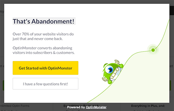
For example, you could ask: “Want to save 10% on your order?” with two buttons — “Yes, get my coupon” and “No, I’ll pay full price.” That contrast alone can drive more clicks.
8. Show Social Proof to Build Trust
Before someone commits to buying or signing up, they often want proof that others have done it first. That’s where social proof can make a big difference.
Use your exit intent popup to highlight how many people have joined your list, used your product, or left positive reviews. This builds trust and helps visitors feel more confident in taking the next step.
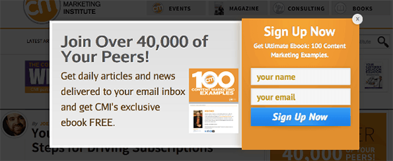
Even a simple message like “Join 12,000 other subscribers” can be enough to push someone from “maybe” to “yes.”
9. Ask for Feedback with a Quick Survey
If someone is about to leave, it’s a great time to ask why. A quick one-question survey can give you insights into what’s not working and help you fix it.
Keep it short and respectful. Ask something like, “What stopped you from signing up today?” and offer a few simple response options or a comment field.
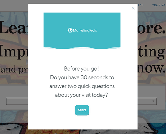
You can even offer a small incentive, like a coupon or freebie, as a thank you for their feedback. It’s a helpful way to learn and re-engage visitors at the same time.
10. Grow Your Social Media Followers
If someone isn’t ready to join your email list or make a purchase, inviting them to follow you on social media is a low-pressure way to stay connected.
You can use an exit intent popup to highlight your Instagram, Facebook, or Twitter accounts, especially if you have a strong following or share valuable content regularly.
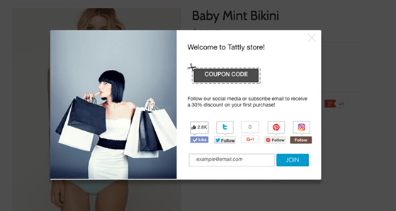
This works best when you mention what users will get by following you, like exclusive updates, behind-the-scenes content, or special offers.
11. Use Animation to Draw Attention
When someone’s about to leave your site, you only have a second to grab their attention. Animating part of your popup can help you do that.
Try adding a subtle bounce to your call-to-action button or a flashing arrow that points to your form. These small movements draw the eye without being annoying.
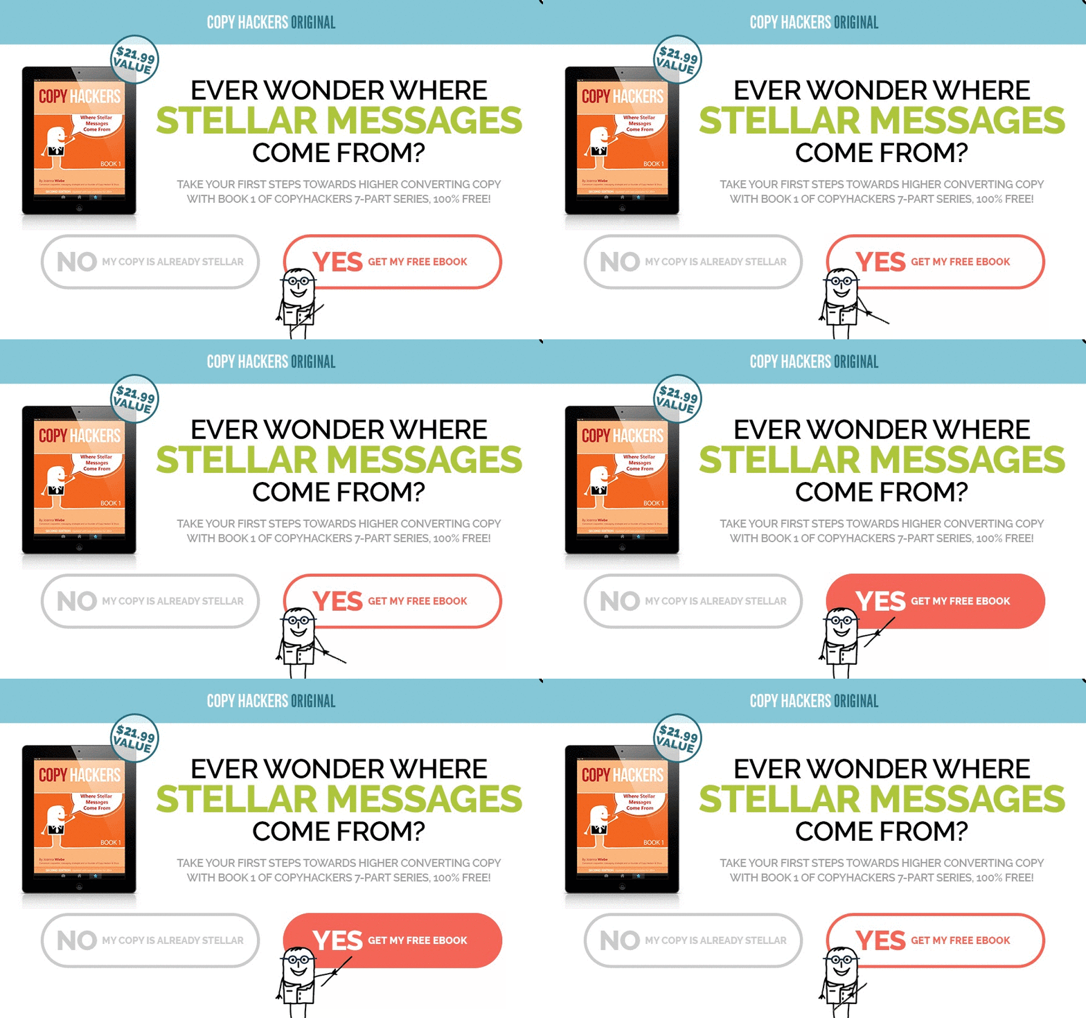
Don’t overdo it. The goal is to highlight the next step, not distract people. Just enough motion to make your message stand out is all you need.
12. Make the CTA Clear and Specific
Your exit intent popup only works if people understand what to do next and want to do it. That’s why your call-to-action (CTA) needs to be crystal clear.
Skip the generic buttons like “Subscribe” or “Submit.” Instead, tell users exactly what they’re getting. For example: “Get My 20% Off Code” or “Send Me the Free Checklist.”
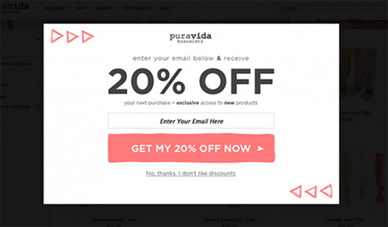
The more specific your CTA, the more confident visitors feel about clicking. Give them a reason, not just a button.
FAQs About Exit Intent Popups
– Focus on one clear call-to-action
– Use strong, benefit-driven copy
– Offer something valuable like a discount or freebie
– Personalize based on behavior or referral source
– Avoid showing the same popup multiple times
– Cart abandonment popups with product reminders or coupons
– Lead magnet popups offering content upgrades or checklists
– Discount or free shipping offers to close a sale
– Social proof popups highlighting recent activity or testimonials
– Quick surveys to understand why someone’s leaving
If someone’s already halfway out the door, you’ve got one last shot to bring them back and that’s precisely what exit intent popups are for.
Even a simple offer like free shipping or a helpful link to your best content can turn that bounce into a subscriber, a follower, or even a sale.
You don’t need to overthink it. Pick one idea from this list and set it up. Then watch how many people decide to stay instead of disappearing for good.
Already running a giveaway with RafflePress? Add an exit popup to promote it; it’s one of the easiest ways to boost entries without changing a thing on your site.
Keep learning:
- How to Reduce Shopping Cart Abandonment
- Lead Generation Ideas to Grow Your Audience
- 7 Best WordPress Popup Plugins (Compared)
- How to Increase Engagement on Facebook
- How to Do a Giveaway to Grow Your Email List
If you liked this article, please subscribe to our YouTube Channel for RafflePress video tutorials. You can also find us on Twitter and Facebook.
